New technology allows anyone with a computer to share their personal maps with anyone around the world. The application of geographic techniques by common people, aided by user friendly software, has since been termed ‘neogeography’. Neogeography has resulted in the evolution of maps from a 2D image to interactive visuals. Online users can now view videos, pictures, and sounds embedded into the maps they view. The ability of anyone to create an effective visual has resulted in the advent of countless maps ranging from nearby restaurants to Iraq War casualties.
A consequence of neogeography is that more opinionated spatial data (i.e. the best pizza shops in town or those who voted for prop 8) is available to the public. This could be beneficial because it involves more local knowledge than a standard map. Also, maps generated by every day users are probably easier to read and free of commercial biases. However, neogeography’s strength of borrowing information from a wide variety of sources is also its biggest weakness. Since the user creating the map is not responsible for the data they upload (as a standardized map is usually created by a company), ‘neogeography maps’ posted online by average users are probably not the most reliable sources of information. Another consequence of neogeography is that, as user generated maps become adopted by more people, it may push regular maps to become more interactive as well.
Saturday, October 17, 2009
Friday, October 16, 2009
Tuesday, October 13, 2009
Lab 2: Map Anatomy
1. Beverly Hills Quadrangle
2. Adjacent quadrangles: Canoga Park, Van Nuys, Burbank, Topanga, Hollywood, Venice, Inglewood
3. The quadrangle was first created in 1966
4. NAD 27 (old version), NAD 83 (updated version)
5. The scale is 1:24,000
6. A) 1200 meters
B) 1.89 miles
C) 2.64 inches
D) 12.5 cm
7. The contour interval is 20 feet
8. Approximate Geographic Coordinates in DMS and decimal degrees
A) Public Affairs Building: 34˚03’40”N, 118˚26’17”W (34.06˚N x 118.43˚W)
B) Santa Monica Pier: 34˚00’31”N, 118˚29’52”W (34.00˚N x 118.50˚W)
C) Upper Franklin Canyon Reservoir: 34˚07’10”N, 118˚24’37”W (34.12˚ N x 118.41˚W)
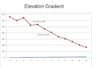
9. Elevations in feet and meters:
A)Greystone Mansion: 580 ft or 177 meters
B) Woodlawn Cemetery: 140 ft or 43 meters
C) Crestwood Hills Park: 640 ft or 194 meters
10. UTM Zone: 1¬1
11. 3,763,000N x 361,500 E
12. 1,000,000 m2
13.

14. 14 degrees
15. South
16.

2. Adjacent quadrangles: Canoga Park, Van Nuys, Burbank, Topanga, Hollywood, Venice, Inglewood
3. The quadrangle was first created in 1966
4. NAD 27 (old version), NAD 83 (updated version)
5. The scale is 1:24,000
6. A) 1200 meters
B) 1.89 miles
C) 2.64 inches
D) 12.5 cm
7. The contour interval is 20 feet
8. Approximate Geographic Coordinates in DMS and decimal degrees
A) Public Affairs Building: 34˚03’40”N, 118˚26’17”W (34.06˚N x 118.43˚W)
B) Santa Monica Pier: 34˚00’31”N, 118˚29’52”W (34.00˚N x 118.50˚W)
C) Upper Franklin Canyon Reservoir: 34˚07’10”N, 118˚24’37”W (34.12˚ N x 118.41˚W)
9. Elevations in feet and meters:
A)Greystone Mansion: 580 ft or 177 meters
B) Woodlawn Cemetery: 140 ft or 43 meters
C) Crestwood Hills Park: 640 ft or 194 meters
10. UTM Zone: 1¬1
11. 3,763,000N x 361,500 E
12. 1,000,000 m2
13.


14. 14 degrees
15. South
16.

Friday, October 2, 2009
African Roads

The map (from http://na.unep.net/globalpop/africa/images/roads.png) depicts the African road network on a 1:4,000,000 scale. The information was collected by the United Nation's Environmental Program.
Motorways, all weather roads, and earth roads are represented on the map in three different colors. Based on the map's information, most of the northern half of Africa has the least developed road system. At first glance the lack of roads could be for a couple of reasons. The first is simply based on economics: lesser developed countries would have fewer roads to facilitate trade. Therefore, a rational assumption would be that northern Africa is less developed than the rest of Africa. Another reason may be due to physical geography, or simply that some natural landform makes road building in this area unattractive. An overlay of physical landforms onto the African road map makes it apparent that the Sahara Desert is responsible for the few roads in northern Africa.
Taiwan MRT Map

The map shows the different lines of the Taipei rail system(known as the MRT), basically a elevated train car system. The information was listed at http://www.csie.ntu.edu.tw/~tfit08/pages/MRT.jpg to direct attendants of a technology conference to the appropriate stop.
The map depicts 5 different tracks that connect different parts of the Taiwanese capital. Unlike many subway maps where actual distances are represented on the map, the MRT shows only relative distances and the order of the stations. This format was probably used to increase the readability of the map as well as for aesthetic purposes. Although the stations are not perfectly represented by how far away they are from each other, the map is still effective in portraying the general shape of the rail and how it changes further down the track. For example, on the green rail between the Zhongshan Junior High School and Dazhi stops, the map shows that the MRT track wavers before beginning a loop to complete a circuit. Another part of the diagram that was striking was that the MRT system lacks a central station where all the lines converge.
World Deforestation Map

The map is from the Millenium Ecosystem Assessment (source: http://images.wri.org/sdm-gene-02-deforestation.jpg), a study funded by the United Nations.
The map shows the areas in the world that have experienced changes in forest cover. The red regions of the map show a net loss of forest, the dark green regions show a net gain of forest, and the light green regions represent the current forest cover. The United States and western Europe have the highest increases in forest cover whereas less developed nations such as Brazil, many parts of Asia, and the Middle East show forest loss. It is interesting to note that a distinct line exists along the Alaskan and Canadian border. The Alaskan side shows a net gain in forest whereas the Canadian border shows no change. Due to this strictly political border, differences in forest regulation or restoration policies are most likely responsible. Curiously, the map does not define how a net gain of forest or net loss of forest was measured (averages over square kilometers). Another interesting part of the map was the exclusion of the time scale.


Subscribe to:
Comments (Atom)